Understanding the Importance of Icons in Design
In the realm of design, icons play an incredibly significant role. They are not just decorative elements; they are crucial to conveying messages and meanings quickly and effectively. A well-chosen icon can communicate complex ideas visually, steering users towards an intended action with ease. Icons reduce the cognitive load on users, allowing for streamlined navigation and improved user experience. From mobile applications to web platforms, understanding the fundamental roles that icons serve can significantly influence the overall design and effectiveness of a project.
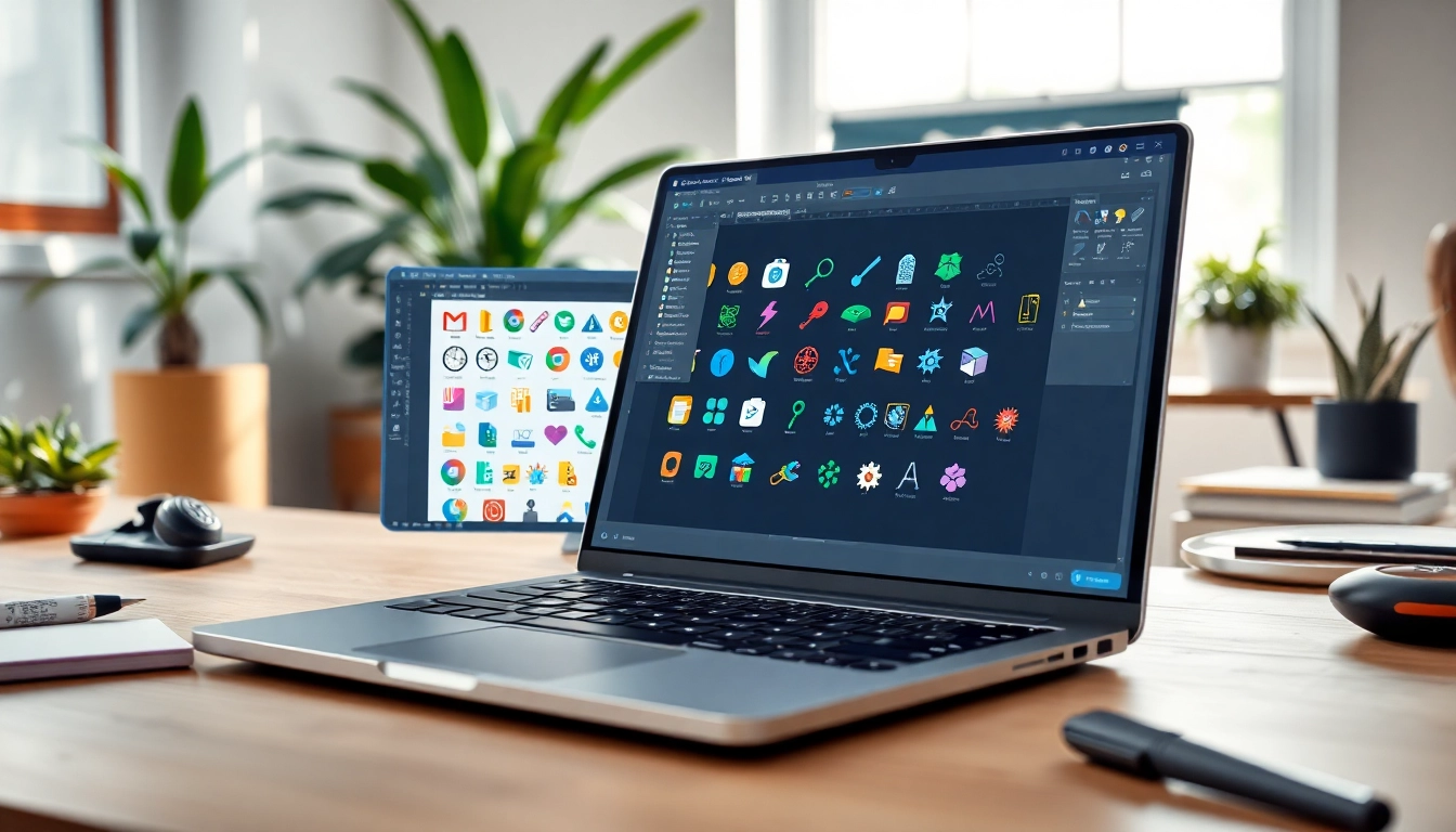
What are Icons and Their Functions?
Icons are graphical representations of an idea, object, or action. They are used to simplify and visually represent concepts that might be too complex for text alone. Icons serve several primary functions, including:
- Visual Communication: Icons provide immediate understanding without the need for words. For example, a trash can icon universally signifies deletion.
- Branding: Unique icons can become part of a brand’s identity, differentiating it in a crowded market.
- Navigation Aid: Icons enhance usability by representing actions like “home,” “settings,” or “search” that users recognize instantly.
The Role of Icons in User Experience
In user experience (UX) design, icons contribute significantly to navigating the interface more intuitively. Research shows that users are more likely to engage with a product that employs intuitive icons. Icons can draw users’ attention to important functions, thereby guiding their interaction with the interface. Moreover, they contribute to a cohesive design aesthetic that can enhance overall satisfaction.
How Icons Can Impact Branding
Icons are pivotal in expressing a brand’s personality and values. For instance, a tech company might opt for sleek, modern icons to convey innovation, while a children’s brand may prefer colorful and playful designs. Consistency in icon usage across various platforms reinforces brand recognition and strengthens the brand’s identity in consumers’ minds.
Types of Icons to Use in Your Projects
Vector Icons vs. Raster Icons
Icons can be categorized into vector and raster types, each with distinct characteristics and applications:
- Vector Icons: These icons are created using mathematical equations, making them resizable without losing quality. Vector icons are ideal for responsive designs where flexibility in size is crucial.
- Raster Icons: Made up of pixels, raster icons (like PNG or JPEG formats) can lose clarity when resized. They are suitable for fixed-size applications such as images or graphics that will not need scaling.
Custom Icons vs. Pre-Made Icons
When selecting icons for a project, one must decide between designing custom icons or using pre-made ones. Each option has its advantages:
- Custom Icons: These are tailored to meet specific branding and design needs. They allow for creativity and uniqueness but require time and resources to create.
- Pre-Made Icons: Readily available and often cost-effective, pre-made icons are useful for quick projects or for designers without the capability to create custom graphics.
The Different Styles of Icons: Flat, Line, and 3D
Icons also vary in stylistic presentation:
- Flat Icons: Characterized by minimalistic design without any shadows or gradients, flat icons are popular for their clean and modern look.
- Line Icons: These icons use a combination of lines to create a simplistic design that is elegant and highly recognizable at any size.
- 3D Icons: Often more visually striking, these icons add depth with gradients and shadows, making them appealing but potentially distracting if not used carefully.
Choosing the Right Icons for Your Audience
Understanding Your Target Audience
Selecting the right icons requires a deep understanding of the target audience. User demographics, preferences, and cultural backgrounds are crucial to ensure that the icons resonate with users. For example, younger audiences might be more attracted to vibrant, animated icons, while older demographics may prefer more straightforward and traditional designs.
Color Psychology in Icon Design
Color plays a vital role in how icons are perceived. Different colors evoke different emotions and associations. For example:
- Red: Often associated with energy and urgency, making it effective for calls to action.
- Blue: Conveys trust and dependability, commonly used in corporate brands.
- Green: Frequently linked to health and nature, making it ideal for wellness brands.
When designing icons, it’s essential to consider the emotional response that colors may elicit from the audience.
Accessibility Considerations for Icon Usage
Accessibility is a significant aspect of icon design. Icons must be clear and recognizable to all users, including those with visual impairments. Here are some best practices:
- Use high-contrast colors to ensure visibility against backgrounds.
- Ensure that the icons carry intuitive meanings without relying solely on visual elements. Providing text labels can enhance understanding.
- Test icons with diverse user groups to gather feedback on clarity and effectiveness.
Best Practices for Implementing Icons
Placement and Size Guidelines
Correct placement and sizing of icons are paramount to effective design. Icons should be placed where users naturally expect them, such as on navigation bars or within buttons. Size guidelines generally recommend that icons be at least 24×24 pixels for touch targets to ensure operability on touch devices.
Using Icons in Navigation and Signage
Icons play an integral role in navigation and signage, enabling users to quickly identify sections or functions within an application or site. It’s essential to maintain uniformity in style and meaning across navigational icons to avoid confusion. Using universally recognized symbols can enhance usability and reduce the learning curve for new users.
Integrating Icons into Mobile and Web Design
With the rise of mobile usage, it’s crucial to optimize icon design for both web and mobile applications. Responsive icons should maintain their integrity and readability across various devices and screen sizes. This includes ensuring that icons adapt visually and contextually to different layouts, providing a seamless user experience regardless of the device.
Evaluating the Impact of Icons on Your Projects
Metrics for Success in Icon Usage
To measure the effectiveness of icons in your projects, consider tracking the following metrics:
- User Engagement: Monitor click-through rates (CTR) on icon-based actions to assess effectiveness.
- Time on Task: Evaluate if users can complete tasks more quickly with well-designed icons.
- User Feedback: Collect qualitative feedback through user surveys to understand perceptions of icon clarity and utility.
Gathering User Feedback on Icons
User feedback is invaluable in determining the success of icon integration. Implementing A/B testing can allow designers to test variations of icon designs and placements to identify which configurations yield better user engagement and satisfaction. Additionally, usability testing sessions can provide insights into how users interpret icons and what changes would improve their experience.
Case Studies: Successful Icon Implementations
Several brands have effectively integrated icons to enhance their products:
- Infographic Applications: Companies that produce infographic tools utilize icons to represent data visually, making complex information more digestible.
- Social Media Platforms: Platforms like Facebook and Twitter rely heavily on icons for actions such as liking, sharing, and commenting, making their functionality intuitive for users.
- Fitness Trackers: Many fitness apps use icons to represent workout types, progress, or achievements, enhancing the motivational aspect of user interaction.
These case studies illustrate how thoughtful icon design and implementation can greatly enhance usability, engagement, and brand perception.